Background
The mission of Algene revolves around utilizing Polymerase Chain Reactions (PCRs) to manipulate plant genes, particularly algae, for the production of resources intended for human consumption. Algene is committed to researching and modifying algae genes to yield pharmaceuticals like digoxin, morphine, and THC.
Within the gene manipulation process, the analysis of DNA's genetic makeup involves the use of primers. These primers play a crucial role, and their precise sequence is determined using various online tools known as "Multiple Primer Analyzers," "Oligonucleotide Properties Calculators," or simply "PCR Calculators." These tools take input genetic sequences and sample conditions, generating primer sequences for scientists to use in their experiments.
However, the current state of PCR Calculators poses challenges, including confusing user interfaces, fragmented resources, and concerns related to corporate interests. Matt, vice-CEO of Algene, recognizing these issues during his tenure as a phytologist, observed that existing websites felt outdated and cumbersome. Moreover, certain platforms seemed designed to benefit larger genetics companies at the expense of scientists in smaller labs, promoting the sale of proprietary PCR sequences.
As an undergraduate, Matt found himself relying on these PCR Calculators for his coursework. He expressed a desire for tools that could simplify and enhance the completion and understanding of scientific tasks, emphasizing the need for user-friendly features that cater to both effectiveness and educational value.

The Solution
Based on these observations, our objective became evident: to develop a new PCR calculator explicitly tailored for the needs of professional scientists. Simultaneously, we aimed to provide tools that would support undergraduates conducting genetics lab work, fostering a better understanding of their tasks. Additionally, our vision was to seamlessly integrate the final product with Algene's primary brand while establishing a distinct identity, akin to the relationships between Microsoft and Xbox or Google and Youtube. After careful consideration, we settled on the name Olygos.io for our version of the PCR Calculator.

Research Phase 1: Secondary (Product Competitor) Research
I split the research process into two phases: product research on the best features of existing PCR calculators and a quantitive/qualitative survey of a poll of Rutger's University genetics students.
During the product research phase, to give me a better idea of what features should be kept, improved upon, or designed for our final project, I asked the company to provide examples of the current PCR websites they were using.
We ended up examining several different websites, picking and choosing key features that we could keep and improve upon in our product.
We also analyzed the flaws and pitfalls of each of the existing products
Product Comparison: Thermo Fisher Multiple Primer Analyzer
Pros
Cons
- Offers some contextual information
- Clear field to fill out
- Simple enough UI
- Lacks accessory info for new users
- Hard to access, trapped in sub layers of website
- Lacks all the Primer information in one place, uses a separate calculator for TM calculations

Click To Enlarge
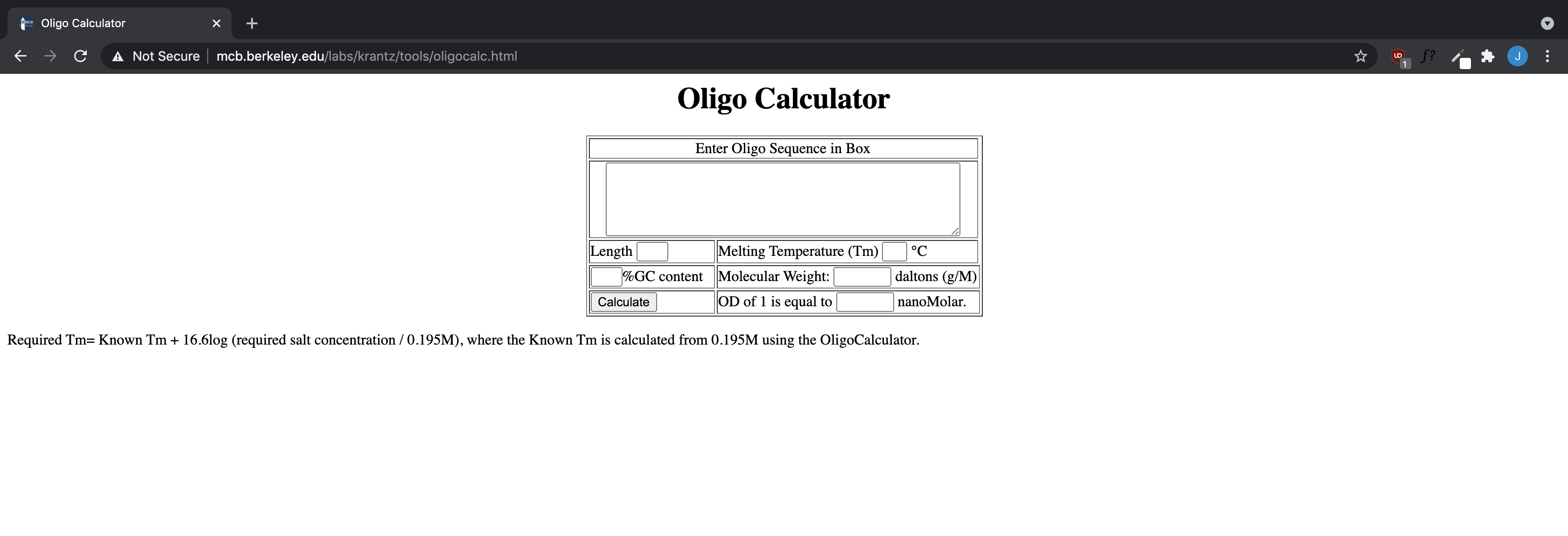
Northwestern University Oligocalc
Pros
Cons
- Offers great educational detail, as expected from a top university
- Offers many options for power users
- Focused, no products to push
- Looks "outdated"
- Visually complicated input, despite simple style
- Offers unnecessary deatail to some extent

Click To Enlarge